Writing for digital product flow? Think Bird Box.
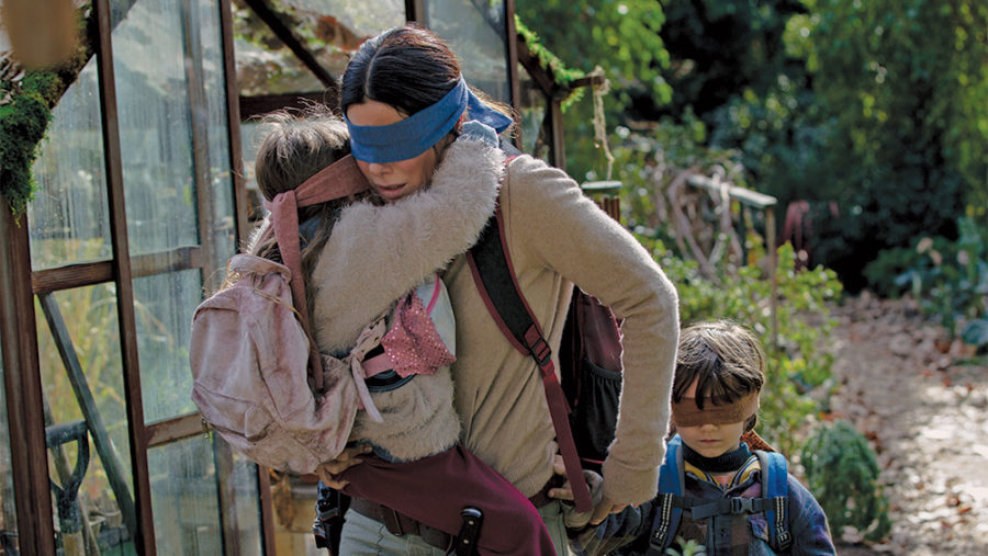
Bird Box is a movie about not being able to use sight. Speaking of not seeing, despite Bird Box blowing up in the news and social media, I don’t personally know anyone besides me who actually saw the Netflix movie with Sandra Bullock.
The gist of Bird Box…
The movie follows a woman who must find a way to guide herself and two children, all three purposely blindfolded, across an unseen outside path and down a river to a distant safety refuge. They must keep their blindfolds on due to a threat that would cause their death if they viewed it through their own eyes.
Why writing for a digital flow or user story is like Bird Box.
Because a user story in a digital experience is essentially a journey or path that offers limited visibility to the user. It’s a path you are asking a user to travel to get to their destination or the place that will provide content happiness.
Because the user doesn’t likely know the terrain and doesn’t know what’s coming next in their digital journey, they are going through your user story or flow almost blind. They don’t have the information or decision-making perspective that you, as the flow’s creator and the business analysts who developed the experience.
Think like you’re the one wearing the blindfold.
To empathize with the user, try to see what it’s like being blind or having limited senses. For those of us who are used to having our full senses available as we walk, imagine blindfolding yourself or keeping your eyes shut and trying to do simple things like move around the house or walk to the local store.
You realize how many cues and signals we take for granted.
Without sight or being able to look ahead, you can’t judge distance. You don’t know when the journey will end. Each step becomes more fraught and each step could be a step forward or a wall or a street or coffee table. Every step is perilous simply because it is unknown. One’s thirst for helpful information becomes more intense.
Blind (or sensory and information-deprived), your users become even more reliant on the content and voice of your writing. It takes on the responsibility to lead your “blind” and anxious users by saying, “Trust me. Follow me.”
How copy and tone leadership makes a difference.
Show them they can trust you to lead them.
- Make sure your messaging and directions are accurate.
If users realize that what you are telling them is vague or doesn’t help them mentally map the flow of the user story, they won’t feel confident about their journey. They’ll also quickly learn not to trust you or listen to you. You’ll just be another data point they have to wade through on their journey.
- Keywords and related language can be critical.
Copy and wording must help “see” and feel their way through the experience. There’s a big difference between a button that says “next” and one that says “enter email” The last communicates it’s a next step while also giving the user visibility as to what to expect next in the journey.
- Provide familiar and understandable concepts. Mental models.
Familiar patterns in both the UI and copy help users create quickly understandable mental models. Obviously, if the user has to treat every new screen in a digital flow as if they are learning how it works from scratch, the whole journey will be a longer, more stressful experience.
Familiar mental models (similar CTAs, design patterns, consistent terms, and language) make the landscape more recognizable by making more actions and decisions intuitive.
In Bird Box, Sandra Bullock finally reaches her destination (spoiler alert).
Hmm. Probably should have said “spoiler alert” first. Anyway, She gets to a sanctuary where other users were waiting. But it wasn’t easy. It doesn’t have to be that way for your users. Help them see their way through your digital user story.


