Fake News Wars. The UX Strikes Back.
A little content strategy advice for Facebook based on what was in my Facebook feed a couple of days ago.
A former high school classmate I’m friends with on Facebook shared a post to express her shock by a story she found in her news feed. It was about Speaker of the House, Nancy Pelosi, apparently diverting 2.4 Billion dollars to cover the impeachment cost for Donald Trump.
Here’s a screenshot of the story feed.

This story would be shocking if it were true.
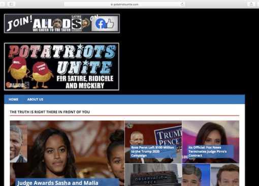
First of all, the source site for the story (I can’t even pronounce this), “Potatriotsunite.com” is already a bit suspicious. And to be fair, there is a small, very small, and hard-to read-bug on the image of Pelosi at mobile size that alludes to satire. If you go to the site, it has one graphic that contains text within the graphic. There is no HTML-based description text, which conveniently makes it invisible to search engines for metadata. The graphic that does contain text describes the site as a place for “satire, ridicule, and mockery.”

I’ll tag the following analysis as my opinion. That description (satire, ridicule, and mockery) seems a bit disingenuous. If you look at the articles available on the site, they seem designed to come off as clickbait-level news once they are shared beyond the site and you can’t see that description graphic.
Some Fake News examples.
“AOC: Children should be raised by the state.”
“Patriot Clint Eastwood Dead at 79; Wills Estate to Trump 2020”
So apparently, based on the source and find reporting like this, Facebook stepped in to flag the story in my feed.

To its credit, Facebook added a small separate post beneath from Factcheck.org as a “related article “ that refuted the story’s claim “Pelosi Didn’t Raid Social Security for Impeachment Inquiry.”
They did something. But did the do the right thing?
The way this fake news story was handled is a problem.
This problem and a possible solution for managing the effect of this fake news post can happen from a content strategy and UX perspective.
This fake news problem is a (likely intentional) UX problem.
A principle idea in UX is to have empathy for the user. That is, to seek to understand how to help them complete the task the way they prefer. Content strategy is helping users get information that is useful.
In the case of Facebook providing news articles, I would assume that a fair application of empathy is to help the user get to helpful new information they can use. Not provide “jokey” articles where you can’t see the punchline and not know that the content provided is a joke or intentionally meant to mislead.
After all, if I kept pressing a button request school photos but the action gave me pictures of donkeys, that’s not considered a good user experience because what you are offering is not in line with my informational intent or task.
Facebook’s action of adding a separate post with a small blue “fact-check” doesn’t help. And frankly, feels a bit lazy and half-assed.
My classmate is shocked. And reposts the story to my feed saying so. I didn’t reach out to her, but I assume she didn’t see anything that flagged the story as untrue in her feed before sharing. And if Facebook did flag it for her, she missed it.
What could Facebook do?
So if the story is false, couldn’t Facebook’s human content reviewers or machine algorithms not pull the story? I believe that they would, fast, if it were nudity or child porn.
Or why not add a prominent mark within that same story that the claim made in the story was fact-checked false, or, if they are afraid to call it false, say “satire?”
Either way, you could stop users from getting clearly false information.
Or if Facebook wanted a more hands-off approach, they could flag the content as questionable in a more prominent way rather than a separate “related story” panel. If users could see it before they read, it would allow them to engage the article with a more of a critical eye.
This Facebook format, as it exists to fix fake news now, does neither.
Instead, it’s like whispering “stop” to a person running towards a cliff they can’t see. You said it, but not in a way that alerts the user to the danger. The other problem is Facebook’s current approach allows dishonest content creators and propagandists to complete their task of passing along false information.
This is not good for two reasons:
One: The purpose of this type of propaganda or two-fold. One is to generate clicks at all costs through a sensational story, even if untrue. I mean, according to the site, Clint Eastwood’s dead. How could you not click on that?
Two: The other purpose is often to plant the seeds of disinformation. As my friend now believes this story about Nancy Pelosi, she will likely share the story online as well as verbally offline with friends.
Those who get the shared story may also pass it because as mentioned in an earlier blog post 59% of links shared on social media have never actually been clicked. So those users are likely to simply share the links based on the headline without ever reading it. So few will realize the story is a “parody” and will treat it as news. This is how a fake news story spreads and eventually gets back to someone like me this next time someone strikes up a conversation at a local Starbucks.
I just happened to catch this one. But this is happening every day – whether for profit, propaganda or both. In this case, it’s not asking Facebook to reinvent the wheel to manage fake news. Just help the user identify it better. A little UX thinking and good content strategy could go a long way, Facebook.


